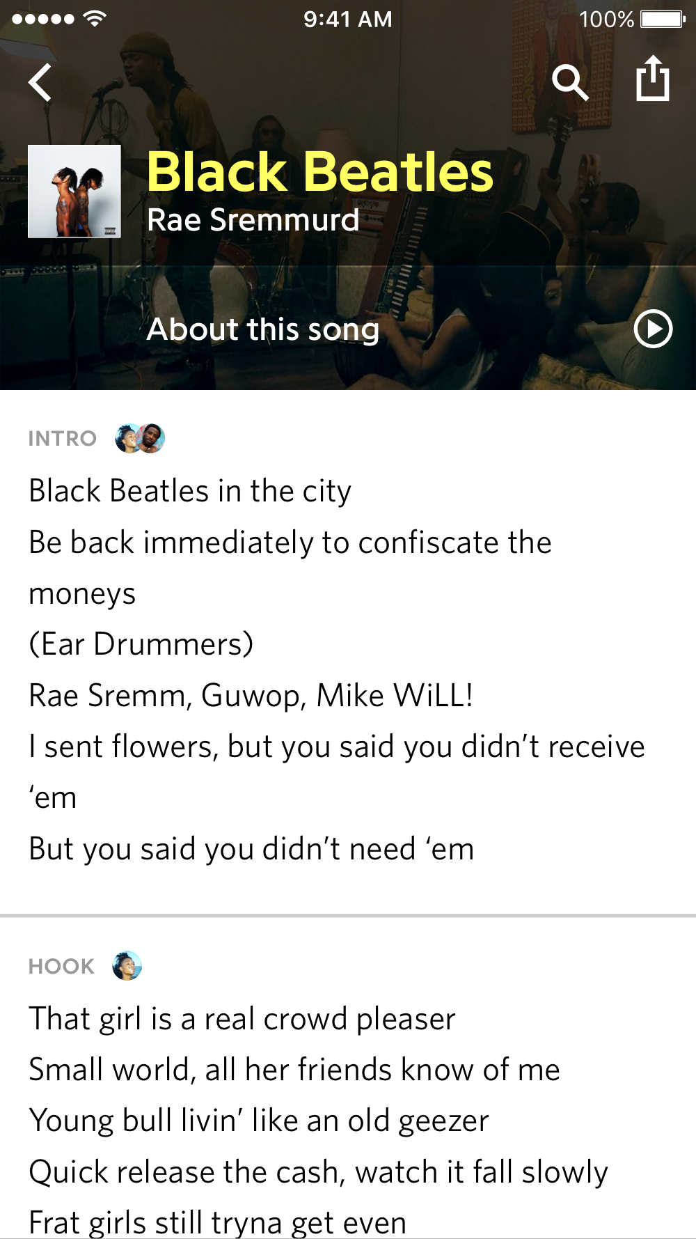
One of the most popular songs on Genius, Rap God by Eminem, has 117 annotations created by 1200+ contributors, a few verified annotations by Eminem, thousands of comments, a couple related articles and videos by Genius, 20+ question and answer pairs, and over 20 pieces of track info like recording location, samples, and the release date. The main product design challenge at Genius is fitting all of this information onto a page without taking away from the lyrics reading experience, and doing all of that on mobile.
The song stories project reimagined the song page from the ground up, replacing every section and every interaction on the page. It began as a wholesale replacement for annotations on mobile, and evolved into a product integration pitch for streaming apps, similar to Spotify’s “Behind The Lyrics” integration with Genius.
I led the project in both phases, and executed all the prototyping and animation. In the second phase I worked closely with other designers.
Phase 1
Phase 2
In 2016, Spotify and Genius worked together to launch “Behind The Lyrics” in the Spotify app — it was a huge success, and by the end of the year Genius was eyeing the story format as a way to expand on the idea, and integrate it into its own product.
“Behind The Lyrics” is just text, and limited to the duration of a song, so a lot of interesting information gets omitted. Building a similar experience on the Genius platform meant no limits on content or media, leading to expanded capabilities like interactive features. For example, the editorial team wrote a fact track card comparing Black Beatles by Rae Sremmurd to Day Tripper by The Beatles — in the Song Story version, we added two interactive slides: an audio scrubber to crossfade between the compared tracks, and a poll to choose which band is best. Instagram Stories had just come out, and polls wouldn’t be introduced there until a year later.
Packaging annotations, comments, articles and videos into a separate experience from the lyrics meant we could show a single, strong call to action on the song page — the lyrics are unobstructed by annotations, and the value proposition of the Song Story is clear: “learn more about this song.”

Before the design process began it was clear that static mockups wouldn’t be sufficient, since the product relies heavily on audio and video, and that the product would have to be reactive to editorial input. I used Origami to create individual interactions and animations, and eventually produced a fully-functioning demo app, fed by a JSON file.
As the editorial team wrote content for Song Stories, I reacted with new templates and interactions that would best highlight it — this is where the polls, audio slider, and more came from. As I added these to the prototype, the editorial team could use it and send feedback and their own ideas back to me.
Later on when we began pitching streaming apps with this concept, the fidelity of each screen became more impotent than the user experience, since it was being presented in decks during meetings, and not actually being used. I teamed up with another designer and focused on animations while they iterated on the visual design. Instead of Origami, I used After Effects to have complete control.
This project was a great opportunity to learn more about prototyping, both the technical parts and how useful it is for collaboration and testing ideas.