In 2016, the homepage for Genius was just a list of trending songs and a paragraph about the company — video and editorial had been growing for a year but weren’t represented.
The goal of redesigning the homepage was to show visitors everything we offered without having to explain it in a paragraph, and to allow interested visitors to dig deeper into any of those categories to learn more. I led the initial design explorations for desktop.
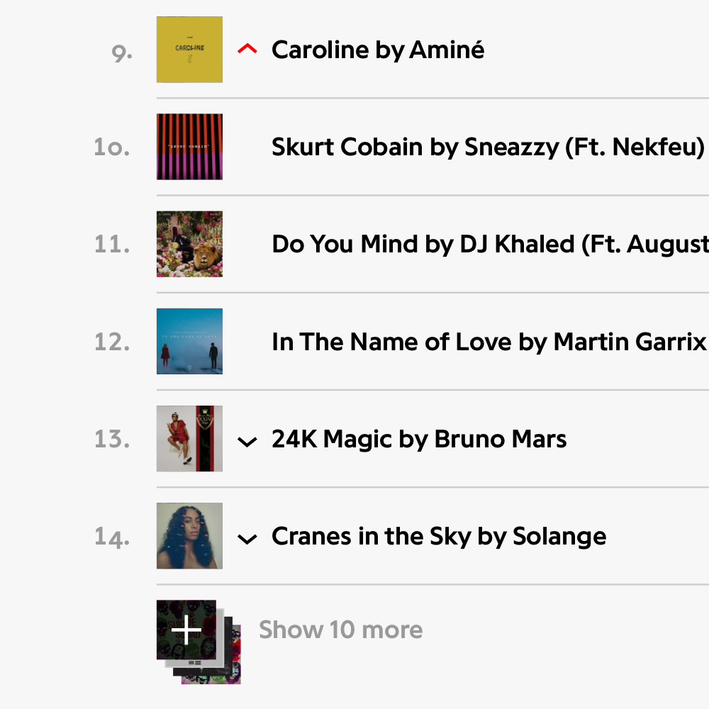
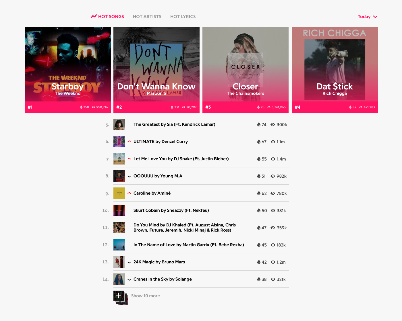
A list of top songs, trending up and down.
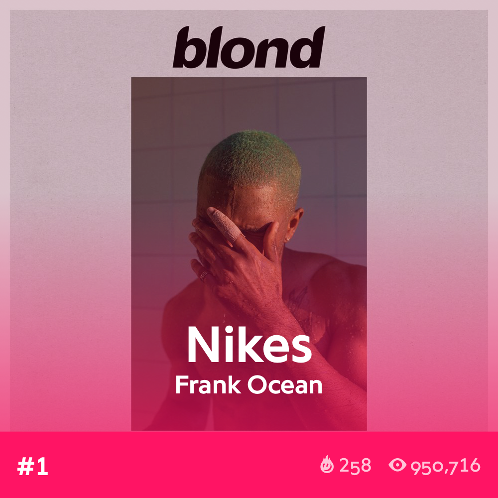
Heavy image treatment creates consistency between each cover.
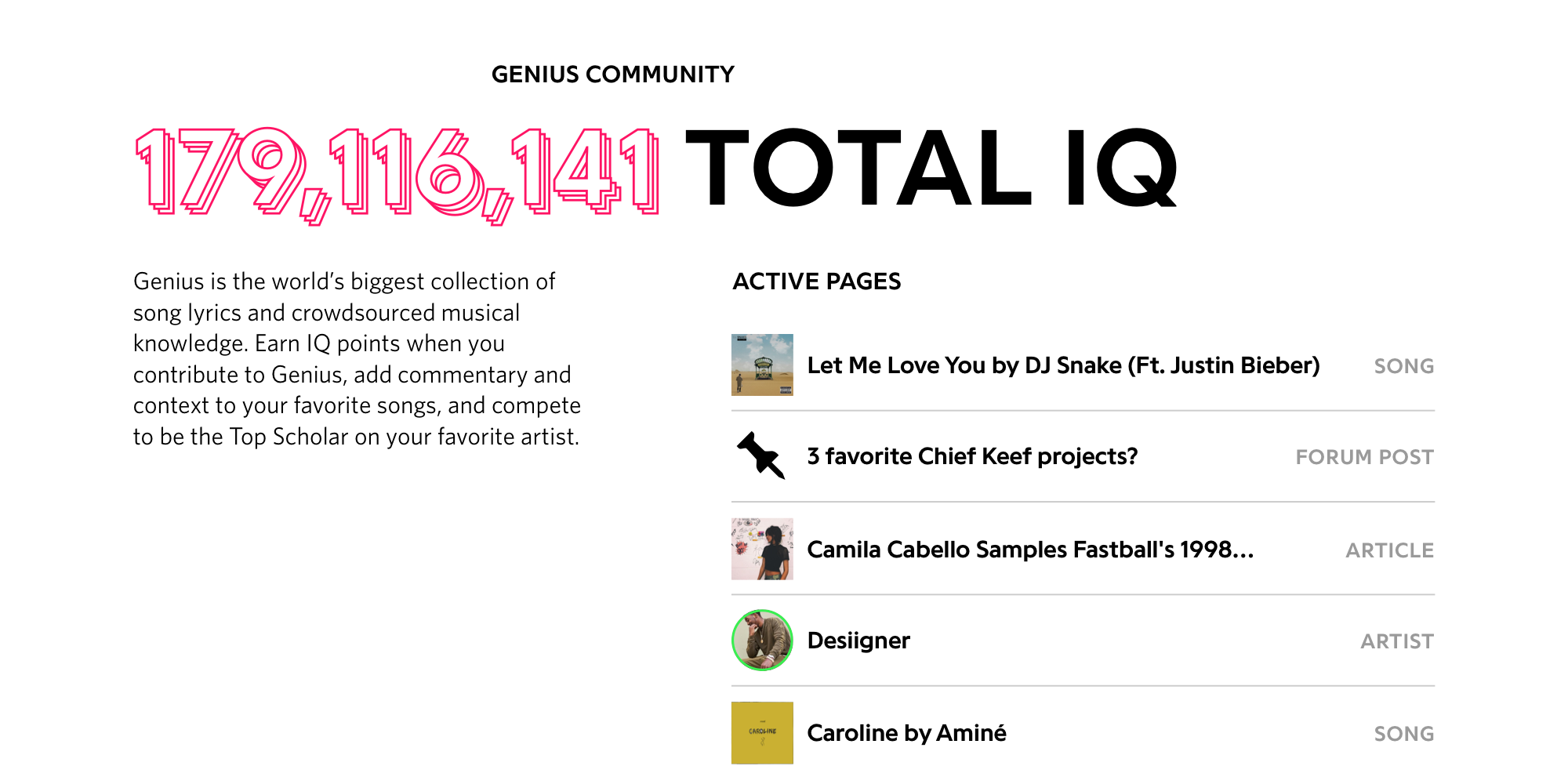
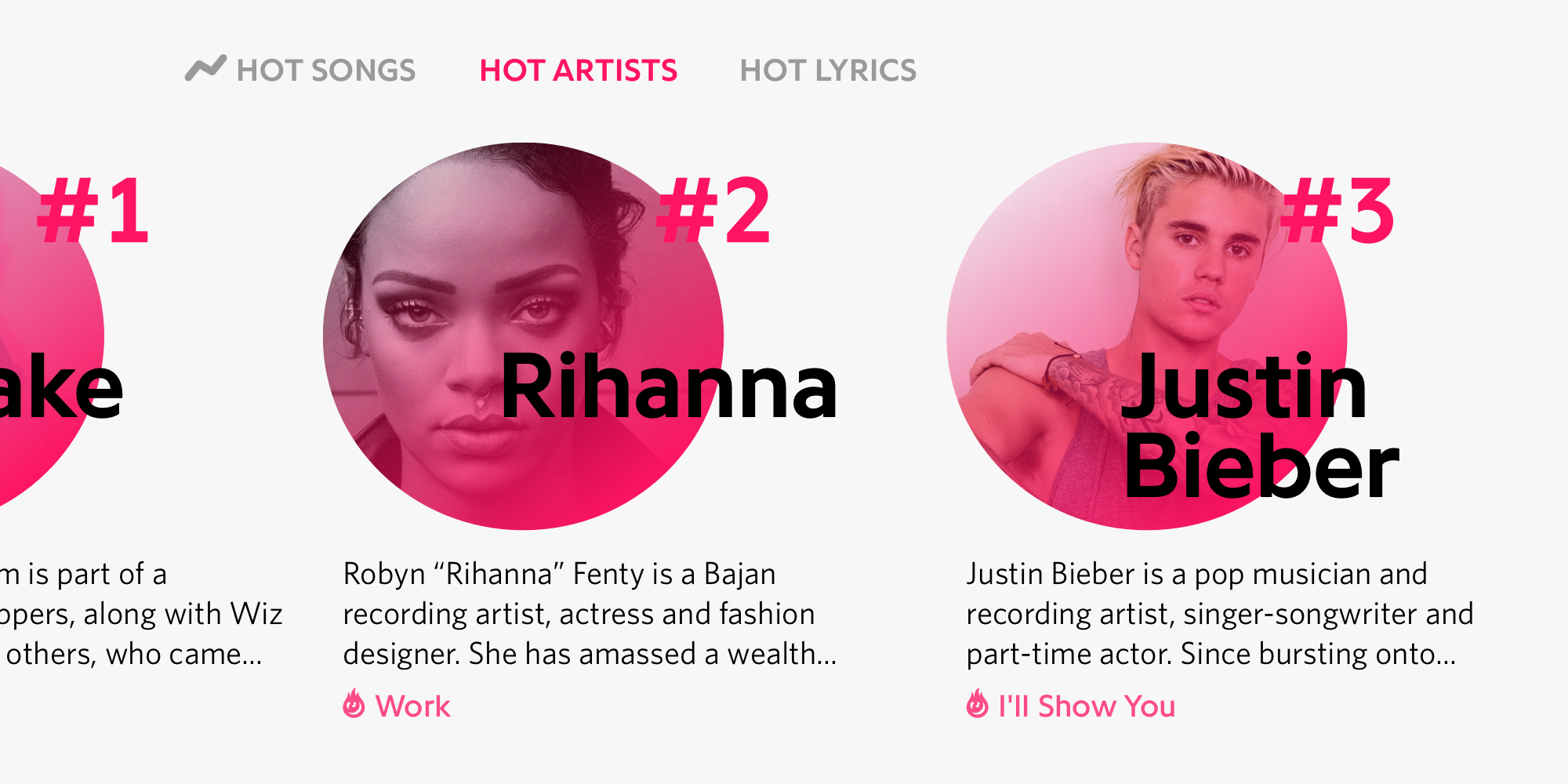
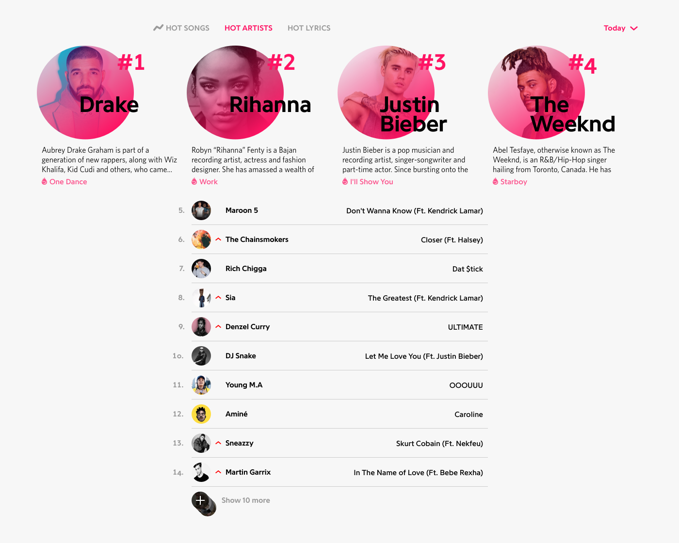
In addition to adding more types of content, we wanted to double down on the trending songs list from the old homepage, and turn it into a real Genius Chart.
Top songs are ranked by the number of visitors reading the lyrics at the moment you loaded the website, which can range from a couple hundred to a couple thousand.
This design shines a bright light on the top four items, and lets the remaining 10, which change more often than the top 4, fight it out below.
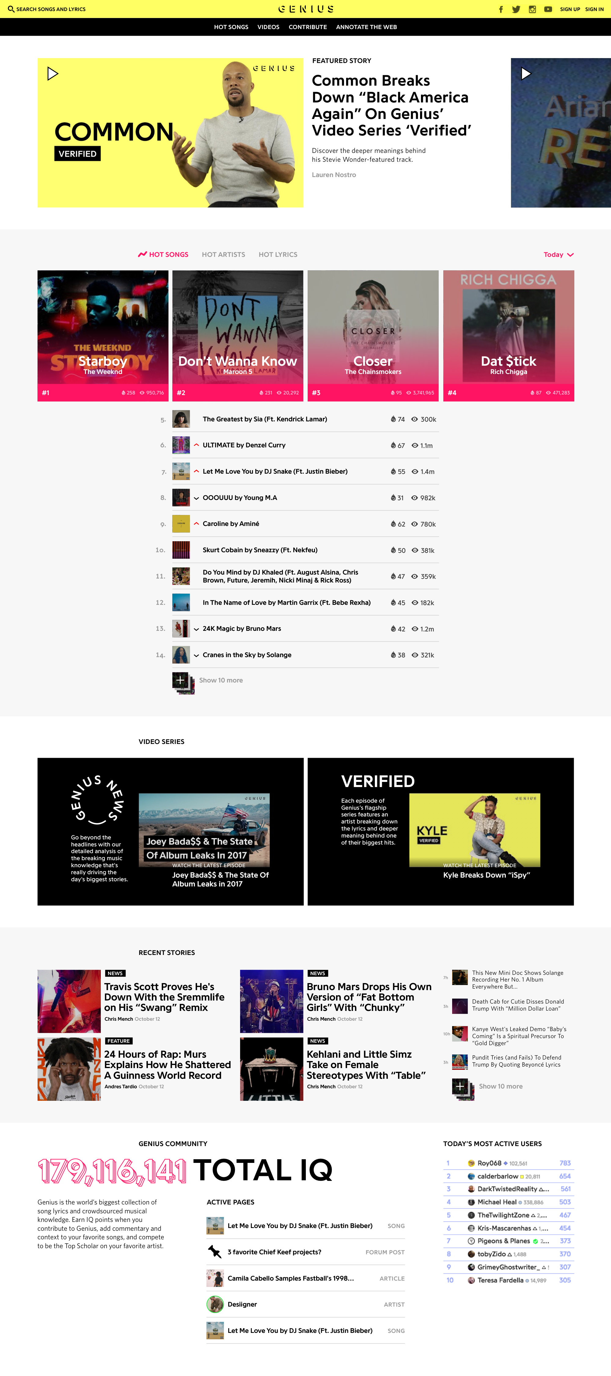
Before this project, the homepage never got a lot of attention, since most traffic goes to the song page. The more Genius becomes a media company, the more important the homepage will become.
Now it’s not only clear from the page what Genius does, and what kind of content you can find on the site, but it’s also a destination for seasoned users, who can dig through a ton of different types of content from one place.